How to Choose the Perfect Paint Colour for Your Home: Expert Tips

Choosing the ideal paint colour for your house requires careful thought as well as some inspiration. Your area will seem different, the mood will be created, and even the worth of your house will be improved with your colour choice. Selecting the perfect paint colours for Melbourne homes requires knowledge of design trends, climatic factors, and personal tastes. This blog offers professional advice to enable you to get amazing outcomes and make wise judgements.
 Knowing the psychological effect of colours enables you to design a house fit for your tastes and way of life.
Matching your paint hue to the architectural style of your property ensures that the colours enhance the structural features of your house, thereby improving the whole aesthetic value of house painting in Keysborough.
Choose the finish that enhances the purpose of the room as well as its visual attractiveness.
Related: Knowing Paint Finishes
Knowing the psychological effect of colours enables you to design a house fit for your tastes and way of life.
Matching your paint hue to the architectural style of your property ensures that the colours enhance the structural features of your house, thereby improving the whole aesthetic value of house painting in Keysborough.
Choose the finish that enhances the purpose of the room as well as its visual attractiveness.
Related: Knowing Paint Finishes
The Impact of Paint Colours on Your Home’s Ambiance
The mood of your living area is much shaped by the paint hues. They affect feelings, spatial impressions, and even energy levels. As an illustration:- Warm Colours: Shades like red, orange, and yellow create strong, pleasant emotions.
- Cool Colours: Blues, greens, and purples help one to rest and find peace.
- Neutral Colours: Whites, greys, and beiges have classic charm and adaptability.
 Knowing the psychological effect of colours enables you to design a house fit for your tastes and way of life.
Why Testing Paint Colours is Essential
A key first step is testing paint samples on your walls before deciding on a hue. Here’s why:- Lighting Variations: Under natural and synthetic light, colours seem different.
- Room Size and Function: In a small area, the same colour could be comforting; in a bigger room, it could be overpowering.
- Interaction with Surroundings: A colour's appearance might be influenced by flooring, furniture, and décor already in place.
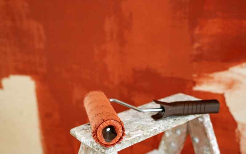
Tips on Choosing Paint Colours
-
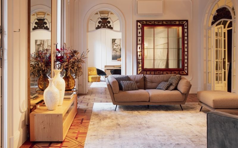
Understand Your Home’s Style and Architecture
- Modern Homes: To keep a neat and elegant look, go for neutral tones like whites, greys, or taupes.
- Heritage Homes: Rich, earthy tones or pastel variants enhance the individuality of historic houses.
- Open Plan Designs: Use harmonic colour schemes to establish flow between linked areas.
 Matching your paint hue to the architectural style of your property ensures that the colours enhance the structural features of your house, thereby improving the whole aesthetic value of house painting in Keysborough.
-
Make use of Melbourne’s Natural Light
- North-Facing Rooms: These get constant light all day, hence cool colours like blues and green are perfect.
- South-Facing Rooms: To liven up dark areas, use warm tones as creamy whites or light yellows.
- East-Facing Rooms: Blushing or peach, soft, warm colours accentuate morning light.
- West-Facing Rooms: To counter the strong evening sun, bold, rich tones look great.
-
Consider the Purpose of Each Room
- Living Rooms: Choose neutral tones or subdued blues and greens to create a friendly and restful environment.
- Bedrooms: For a peaceful relaxation, choose light grey, lavender, or pastel tones.
- Kitchens: Bright, vivid colours—like yellows or reds—can boost hunger and vitality.
- Bathrooms: Whites, light greys, or soft blues evoke a clean and serene feel.
-
-
Explore Popular Paint Trends in Melbourne
-
- Earthy Tones: Warm browns, olive green, and terracotta all help to link indoor areas with nature.
- Neutral and Minimalist: A flexible canvas for decoration are timeless whites, beiges, and gentle greys.
- Dramatic Accents: Deep blues, charcoal, or even black make outstanding feature walls adding character and depth.
-
Use the 60-30-10 Rule
- 60% Dominant Colour: Covers most of the space (walls, large areas).
- 30% Secondary Colour: Supports the dominant shade (furniture, upholstery).
- 10% Accent Colour: Adds a pop of contrast (decor, accessories).
-
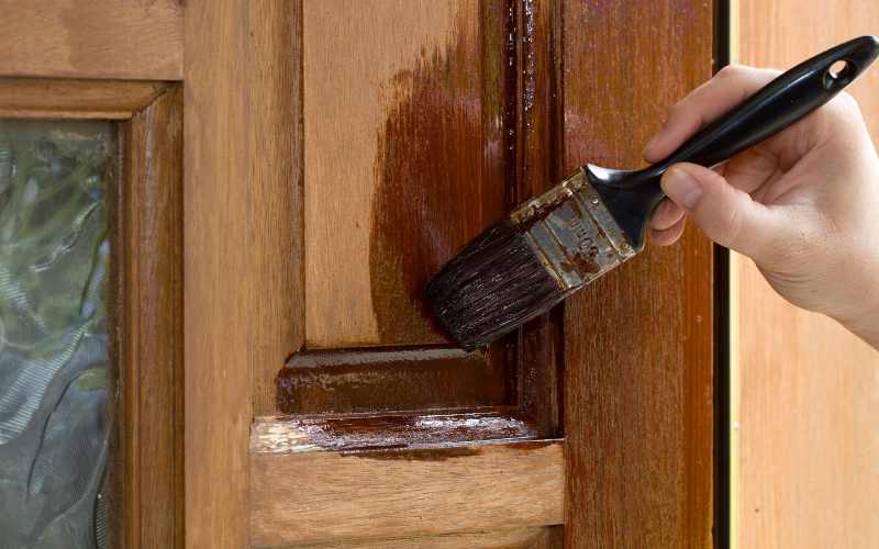
Don’t Overlook Paint Finishes
- Matte/Flat: Perfect for low traffic areas as it offers a seamless, nonreflective appearance.
- Satin: Perfect for bedrooms and living spaces that need a subtle shine.
- Semi-Gloss: Reflective and strong; ideal for bathrooms and kitchens.
- High-Gloss: Provides drama and is perfect for stressing architectural features.
 Choose the finish that enhances the purpose of the room as well as its visual attractiveness.
Related: Knowing Paint Finishes
Choose the finish that enhances the purpose of the room as well as its visual attractiveness.
Related: Knowing Paint Finishes
-
Test Before You Commit
- Test how different walls in the space interact with lighting by arranging swatches on them.
- Check the samples at many times of the day to observe how the colour changes.
- To be sure the finishes satisfy your tastes, think about testing many finishes next to the colours.
-
Coordinate with Existing Elements
- Match cool colours to contemporary furniture with glass or metal surfaces.
- Match earthy fabrics and wooden furnishings to warm colours.
- For tiled areas, use colours that accentuate the tile pattern and hue.
-
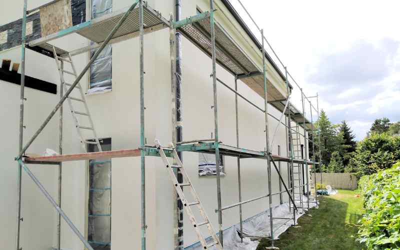
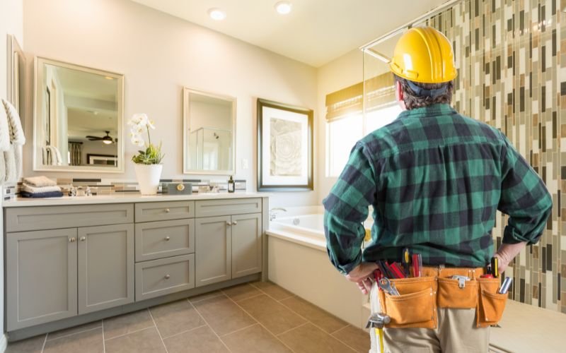
Seek Professional Guidance
- Professional painters provide understanding of colour trends and useful application strategies.
- Professionals guarantee perfect finish, therefore extending the lifetime of your paint.
-
Final Touch: Personalise Your Space
- Including strong accent walls to show originality.
- Including family favourites will help to build significant areas.
- Playing around with unusual colour combinations to make a statement.