Colour Selection for Rooms with Poor Lighting

"A poorly lit room can make even the most beautiful furniture feel dull, flat, and lifeless."
That’s the hidden truth many Melbourne homeowners discover after painting a space. The colour you choose doesn’t just set the mood, it determines whether your room feels warm and inviting or gloomy and oppressive.
Here’s the catch: rooms with little or no natural light play tricks on colour. A warm grey that looks soft and elegant on a paint swatch may suddenly appear muddy in a dark hallway. A crisp white can turn sterile and flat when there’s not enough sunlight to bring it to life. I’ve seen it happen countless times, the room’s lighting (or lack of it) changes how every shade behaves.
The good news? With smart colour selection for low light rooms, you can completely transform a space. This guide will talk about paint colours for rooms with little natural light, what colours make dark rooms look brighter, and things to stay away from. We'll also talk about paint finishes, undertones, and tips that are only useful in Melbourne so you can make smart choices.
These tips will help you get a look that is bright, welcoming, and timeless, whether you're painting a small apartment in the city, a north-facing living room, or a hallway that isn't very well lit.

Why Lighting Matters in Colour Selection
Before we talk about specific paint colours, we need to talk about why lighting is so important.- Natural Light Direction: In Melbourne, rooms that face north (in the southern hemisphere) often don't get as much direct sunlight as rooms that face south. This affects how colours look on your walls.
- Artificial Lighting: Warm yellow bulbs amplify warm tones, while cool LED lighting can make even creamy whites appear stark or blue.
- Light Reflectance Value (LRV): This tells you how much light a colour of paint reflects. Soft whites and cream-coloured paints have high LRV, so they reflect light around the room. Whereas low LRV paints, like dark blues and greys absorbs light that makes the room even darker.
Best Paint Colours for Rooms with Little Natural Light
These are some colours and tones that have been shown to work well in dark places:Warm Whites and Off-Whites
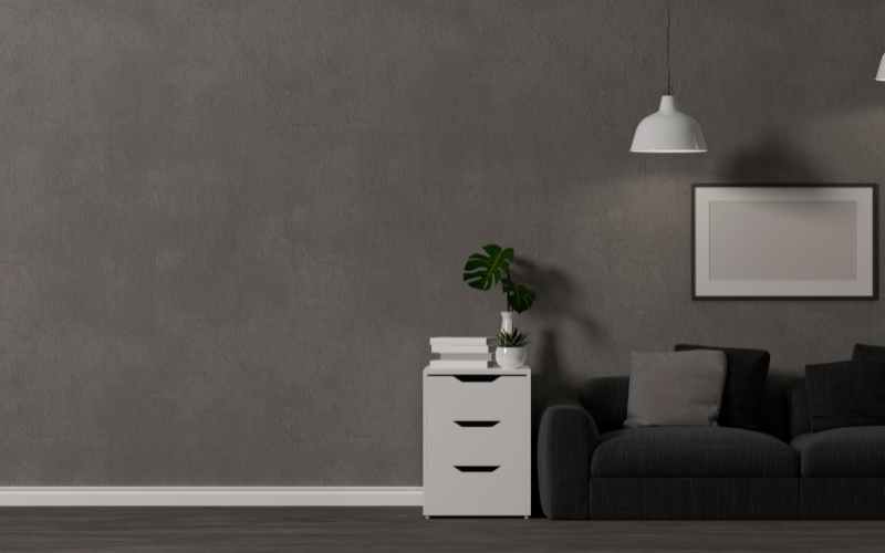
Stay away from stark, pure whites; they can look flat and clinical when there isn't any light. For rooms with low light, choose off-white instead of cream. Warm undertones in colours like soft ivory, cream, or warm beige help make a room feel warm and inviting.
Soft Neutrals with Warm Undertones
Greys, taupes, and beiges with hints of yellow, peach, or pink undertones prevent the colour from feeling cold. For example, a warm greige can add depth while still bouncing light.Pale Pastels
Colours like pale peach, soft lavender, or light sage green can brighten a space without overwhelming it. These soft colours also look great in bedrooms..
Warm Paint Colours for North-Facing Rooms
Rooms that face north in Melbourne often feel dark and cool. Warm colours like buttery creams, neutrals with terracotta in them, or pale apricot make the space feel more welcoming by balancing out the coolness.Light Reflective Paint Finishes
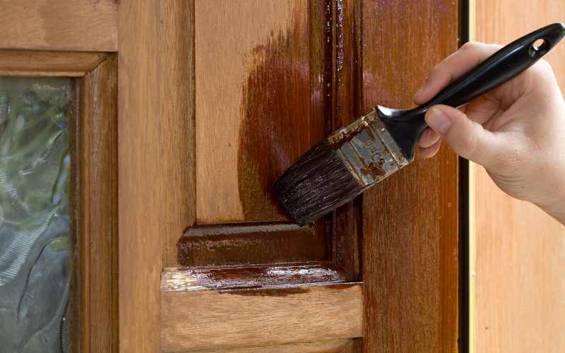
Choosing the right finish is just as important as the colour itself. Semi-gloss or satin finishes reflect more light, making them ideal for hallways and small rooms. Matte finishes, by contrast, absorb light and can make a dim room feel even darker.What Colours to Avoid in Poorly Lit Spaces
It’s not just about what works, it’s equally important to know what doesn’t. Here are common mistakes homeowners make:- Cool Greys and Blues: These shades can feel flat and depressing in dim lighting. Unless warmed up with décor, they often don’t work well in poorly lit rooms.
- Deep Dark Colours: Charcoal, navy, and forest green absorb light and make small or dim rooms feel more cramped.
- Pure White: While tempting, crisp white can look shadowy and dull without enough natural light to energise it.
- High Contrast Pairings: Sharp contrasts between walls, trims, and ceilings can look harsh and unbalanced in low light.
Warm vs Cool Undertones: Which Works Best?
Undertones are the subtle hues beneath a paint colour. In low-light spaces, warm undertones (yellows, reds, pinks) almost always perform better than cool ones (blues, greens). For example:- A warm beige with a peach undertone will look soft and cosy in a dim bedroom.
- A cool grey with blue undertones may feel icy and uninviting.
Paint Finish That Reflects Light Best
Choosing the right paint finish can make or break your project.- Satin or Eggshell: Great for bedrooms and living rooms, they reflect light and have a subtle texture that is just right.
- Semi-Gloss: It reflects the most light, so it's perfect for hallways, kitchens, and bathrooms that don't get a lot of natural light.
- Matte: Because it absorbs light instead of reflecting it, it's best not to use it in dark places.
Combining Paint Colour with Lighting Design
Just changing the colour won't fix all the lighting problems. Using clever lighting and paint colours that make dark rooms brighter can make a big difference.- Use warm LED bulbs to bring out the creamy tones.
- Put sconces or lamps in dark corners.
- To make them look brighter, use mirrors, metal frames, or glass surfaces with lighter wall colours.
Melbourne-Specific Considerations
The way homes in Melbourne are lit is different from other places:- Many old houses have hallways that are small and don't get a lot of light from outside.
- A lot of the time, apartments have bathrooms without windows or bedrooms that are inside.
- The weather changes a lot between seasons, which means the amount of natural light changes a lot too.
Practical Tips for Choosing Paint in Dim Rooms
- Before you buy, try it out: Use paint swatches directly on the wall rather than tiny sample cards.
- Check Under Different Lighting: Examine artificial lighting and the light in the morning, afternoon, and evening.
- Use Higher LRV Colours: The higher the LRV, the more reflective and brightening the paint.
- Don't Forget the Ceiling: The paint gets brighter and more reflective as the LRV rises.
- Layer with Decor: Use metal accents, mirrors, and vibrant textiles that complement the colour of your walls for the greatest effect.
Local Painting Expertise in Melbourne
Picking the right colour for dark spaces isn't easy, which is why you should hire a pro. Whether you're updating a bedroom, hallway, or planning to paint your house in Malvern, professional painters can help you make the best choices for your lighting conditions.